Exercise 1.2
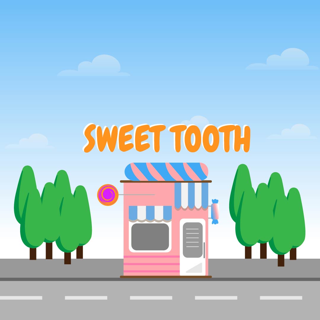
Web project that needs a revamp
Suggestions and Feedback
- Game works perfectly
- Font and colors are very bright and lively
- Game interface is not clear
- Game is fun to play
- Buttons should be more attractive
- Slightly not enough contrast in graphic elements
- Candies look to similar to the broccolis which is a problem for gameplay
My plan
- Fix landing page: Add more emphasis on buttons, improve background.
- Add some of my own identity into the illustrations.
- Keep consistency on different interfaces.
- Make candies distinct to the broccolis so that users dont get confused.
- Improve gameplay background, remove gradient.
- Change fonts in the interface
- Add favicon